Project management circles
Published on: 2025-10-16
Reading time: 5 minutes
A different way to visualise the relationship between the scope, quality, and time/cost of a project.
By Tom Hulton-Harrop
Motivation
This idea came about after not being particularly satisfied with the project management triangle. What the project management triangle represents is great, however this is an attempt to represent the constraints slightly differently.
Enter, project management circles…
Note: I’m aware it would be possible to represent the following diagrams in one dimension (essentially as kind of line), however I don’t think that looks as fun/interesting, so I made the executive decision to use circles, primarily for aesthetic reasons 😅.
Project management circles
Let’s start by introducing the new diagram to represent the constraints of project development.
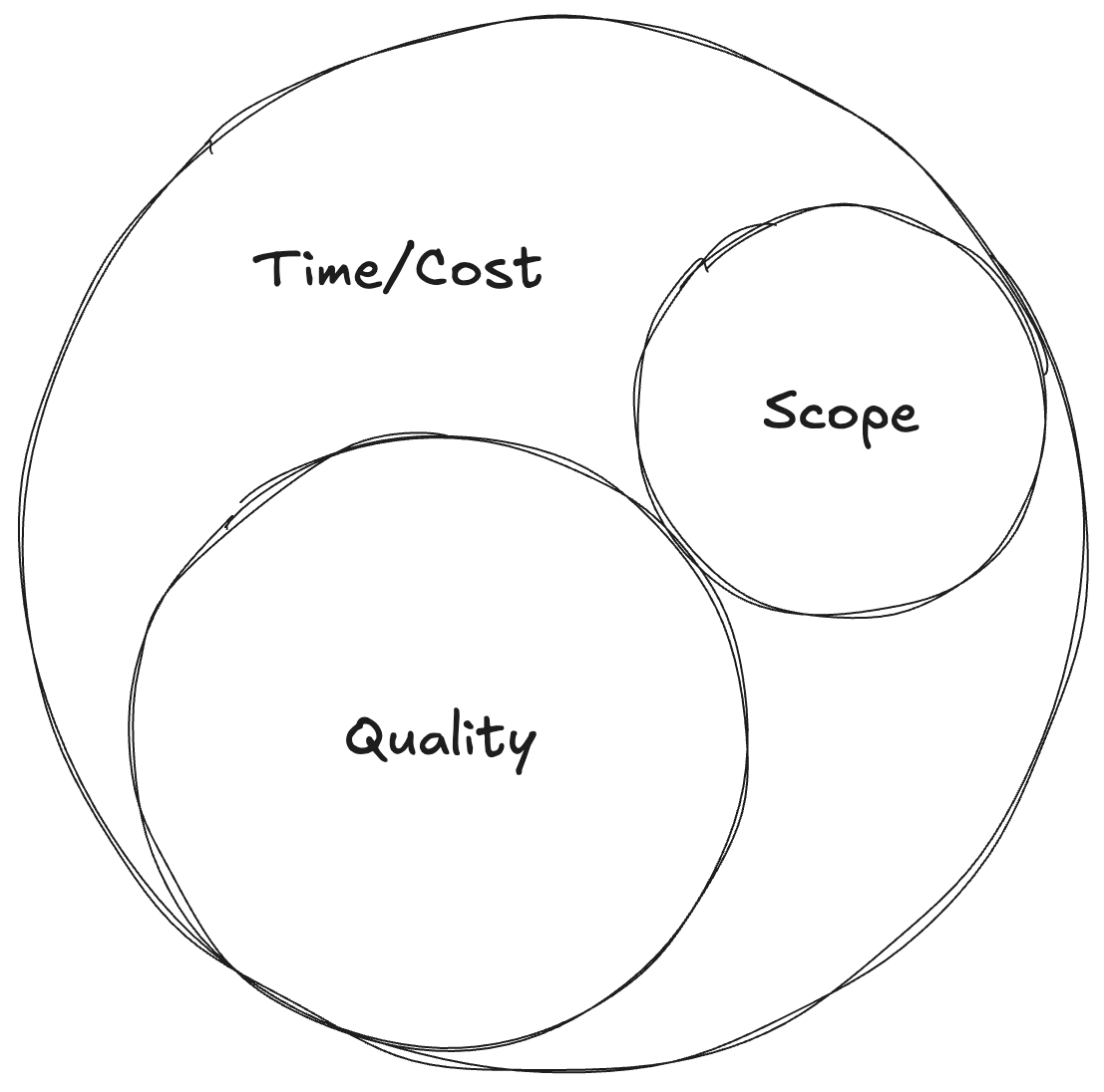
The key idea is to first separate intrinsic factors (scope and quality, represented by the inner circles), from extrinsic factors (time and cost, represented by the outer circle). We start with a circle of a fixed size (ideally on a grid that can act as a reference space), which represents both time and cost (in my mind these are effectively the same, delaying a project increases costs, hiring more developers or buying more hardware also increases costs - as the project manager, you decide which lever to pull).
We then add the first inner circle, scope. This is what we want our product to do. This will take up a certain amount of space inside the outer circle given the initial time/budget we have. The next circle represents quality1. It has to fit inside the outer circle, without overlapping with the existing inner circle. Ideally we have a perfect alignment where all features and the quality/robustness/reliability of said features, fit within the outer circle (this is if we’ve planned and scoped everything perfectly, which of course never happens, but let’s just pretend for now).
The really nice thing about this diagram is how we can use it to visualise change. As soon as the radius of one of the circles changes, we get an overlap, and this immediately tells us something else has to change (the dotted circles represent the initial value of either scope, quality or time/cost).
For example, suppose we have an increase in scope. We can visualise this in the following way.
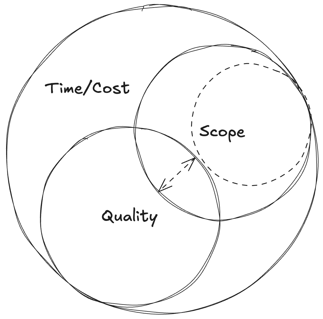
The constraint of no overlapping circles has been violated, so we need to make a change. We have two options; the first is to continue with the current schedule/resources we have (no change to time or cost), and reduce quality. This usually isn’t an explicit decision, but it will happen in some form or another. Corners will be cut on what we’re delivering (less testing, less error handling, less reliable systems, less polish etc…), so quality will drop.
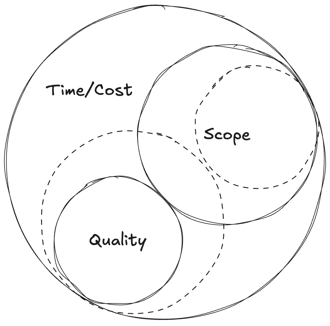
Another option is we increase the outer circle. This means increasing cost indirectly by delaying the project and increasing the schedule, or by buying a ton more hardware to (in theory) allow the team to work more efficiently, or hiring more developers (ideally more senior/experienced developers) to deliver the project faster than we could have otherwise (this discounts the classic Brook’s law, which may well also happen, but let’s pretend we do hire experienced developers with excellent communication, who have shipped something similar before and can start delivering right away).

If we do this, in theory we can keep the same level of quality, and handle the increased scope, but our project is either going to be delayed, or require more engineers (both of which ultimately add cost).
The good news though, is this also works in reverse. Say we feel we’re running out of time, but still want to deliver the project on a fixed date (or we may only have so much money left before we go bust). We’d represent this with the outer circle getting smaller so it no longer contains the inner quality and scope circles.
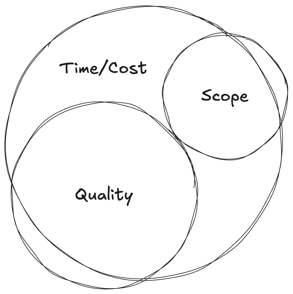
We’re determined to keep a high quality bar, so we have to ruthlessly prioritise and cut, cut, cut. We can visualise this with the quality circle remaining unchanged, but with the scope circle appearing significantly reduced.
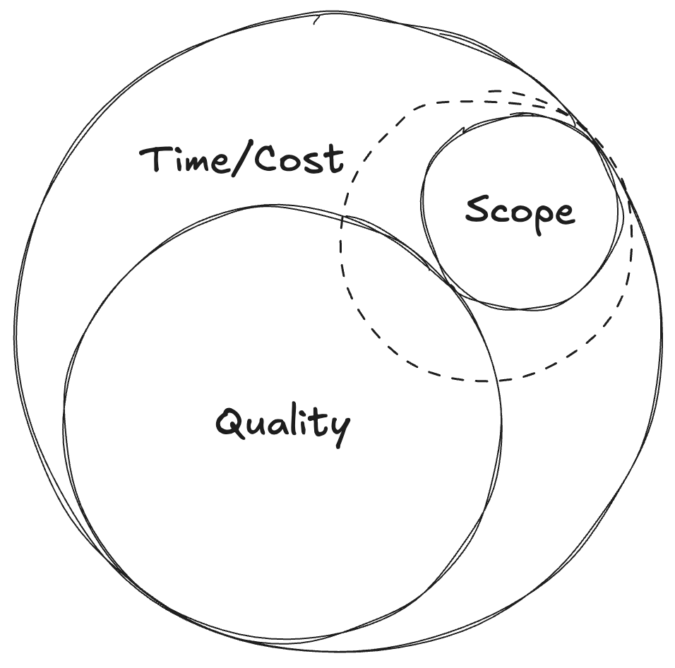
There are a bunch of other examples (one is the rare case where we actually have more time or money, so can decide to increase scope or quality), but hopefully the above gives a flavour of how these visualisations may be helpful to communicate how each of these factors are interconnected. There’s no do more with less, this lays bare the cold, hard reality of how the project will be impacted, and also makes clear if any of those circles are overlapping, the project will likely fail in one way or another.
Summary
Hopefully this way of communicating project constraints was interesting, and it’d be amazing if it actually proves useful to someone when communicating difficult decisions to leadership in future (please let me know if it does). I haven’t come across this way of visualising things before, but it’s entirely possible someone else has already had this idea and I’m reinventing something that already exists. If that is the case, please do let me know and I’ll make sure to link to it from this post.
Thanks for reading!
Footnotes
-
If it helps, you can also think of this as polish. Essentially the amount of attention, care and refinement given to features within the product. ↩